UI/UX & Frontend
Custom Design Systems & Component Specs
Reusable, accessible, and themeable React component libraries that maintain brand consistency across all touchpoints.
Overview
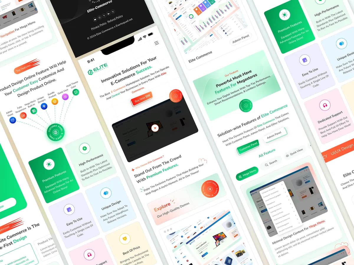
We design and build tokenized component libraries — typography, color, spacing, and elevation all documented and reusable — so your product stays visually consistent as your team and codebase grow.
Highlights
Tailwind CSS v4 Engine
Accessible WAI-ARIA
Figma Token Sync
What's Included
Tokenized color schemes, typography scales, and glassmorphism elevation layers
Full dark/light mode switching with smooth color transitions
Documented, reusable component libraries with automated visual regression testing
Complete accessibility compliance (WCAG 2.1 AA level)
Starting At
Get a Quote$4,200/ project
Includes full component documentation